In the interactive space of a web game, color is not merely a decorative choice; it is a fundamental channel of communication. Before a player reads a tutorial or understands the mechanics, their brain has already processed the chromatic data on the screen, making subconscious decisions about safety, danger, value, and interactivity. Mastery of color theory is what separates confusing interfaces from intuitive, tactile experiences.
Affordances Through Chromatic Contrast
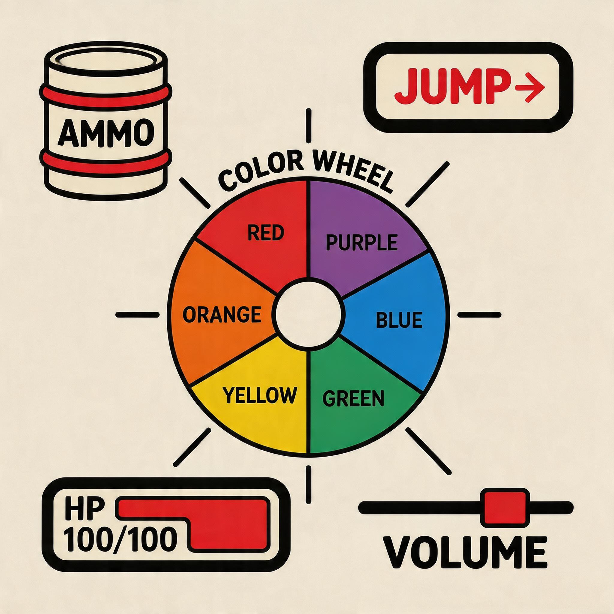
In UX design, an 'affordance' is a visual clue that tells the user how an object can be interacted with. In gaming, color is the primary driver of affordance. Consider the universally understood language of video game barrels: a red barrel will explode, a green barrel contains acid or health, and a brown barrel is merely an obstacle.
To make these interactive elements "pop," designers utilize complementary color schemes. If a game's environment is predominantly cool blues and greens (like a forest at night), the interactive elements—enemies, collectibles, buttons—will often be painted in warm oranges or vibrant yellows. This high contrast draws the eye immediately, guiding the player without a single word of text.
"Color is the silent director of the player's attention. If everything is vibrant, nothing is important." — Lead UI/UX, LUDOLORE
Emotional Resonance and Palettes
The overarching color palette dictates the psychological tone of the game. A hyper-casual puzzle game might utilize an analogous palette of pastel pinks, purples, and blues to create a soothing, low-stress environment. Conversely, a high-stakes action game will lean heavily on stark contrasts—deep blacks, harsh neon reds, and blinding whites—to induce a state of physiological arousal and tension.
The Rule of 60-30-10
Many successful UI designs follow the 60-30-10 rule, adopted from interior design:
- 60% Dominant Color: Usually a neutral background (like the `#F4F0EA` of this very page) that rests the eyes.
- 30% Secondary Color: Used for structural elements, secondary menus, and non-critical visual interest.
- 10% Accent Color: Reserved strictly for primary calls to action, the player character, or critical warnings.
Accessibility and Color Blindness
A crucial aspect of modern web game design is ensuring that color is never the *only* conveyor of information. Approximately 8% of men and 0.5% of women experience some form of color vision deficiency (CVD). If a puzzle game requires matching red and green gems, it becomes unplayable for someone with deuteranopia.
To solve this, designers must employ redundant coding. A gem should not just be red; it should be red *and* shaped like a triangle, or possess a specific animated glow. Testing game palettes through CVD simulators during the design phase is no longer optional; it is a mandatory step in creating inclusive digital environments. Color should guide the player, never gatekeep them.